What is information?
Information is data that has been put into context such that it has value and you could use it to make meaningful decisions. Data without context isn’t very helpful.
Data Visualizations
As dashboards and other data-heavy applications become increasingly common, so do the use of data visualizations to make information out of that data. This is partly due to their being attractive and largely due to their ability to communicate trends, draw comparisons, and highlight relationships between different variables quickly and efficiently.
Even if you are not a statistician you have probably seen many data visualizations in news articles, on blogs or social media, and in your work life as well. As you become a frequent consumer of information through data visualizations and use them to make decisions and assessments in your personal and professional life, we would encourage you keep the following questions in mind. You can ask the following questions and be critical of the data visualizations you use in your decision making to ensure that you have the most complete and accurate picture informing you.
Who created/published this visualization?
When evaluating all of these questions you should bear this one in mind. We encourage you to consider the source. Does the publisher or creator of this data visualization stand to gain (or lose!) something if specific conclusion(s) are drawn from this visualization? If the honest answer is yes, then you should be extra critical of anything in the data visualization that makes the publisher/creator’s most self-interested outcome more attractive.
What data was omitted?
There is almost no case where the creator of a data visualization hasn’t omitted some factor(s) related to the visualization’s underlying subject matter. This is due to the fact that every factor you represent makes your visualization more complex, and you have to draw the line somewhere. However, it could also be due to a deliberate bias or desire to make a certain conclusion seem more attractive/likely than another. You should be extra critical of any related data you know is relevant but was omitted, and try to figure out why.
Do the colors make it hard to read or favor a certain conclusion?
Color Associations: Manipulation of your decisions can be embedded into a visualization down to the colors chosen to plot them. As an example, in western cultures we generally associate green with positive and red negative. We generally associate bright colors with happy things, green with money, etc. Consider if any potential desired conclusions by the creator are presented in colors with more positive associations than other data.
Color Scales: rainbow color scales, grayscale, light to dark, are common ways of communicating relative change between values. Be extra careful with rainbow scales. As humans our eyes are not well-equip to detect slight color changes in the green spectrum, which means that rainbow shading causes us to lose a lot of comparison ability through the entire middle of that scale. Below are examples of a mappings that use color scales to shade relative differences. In each case, the rainbow is the most difficult to detect detail.

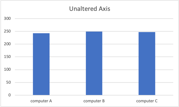
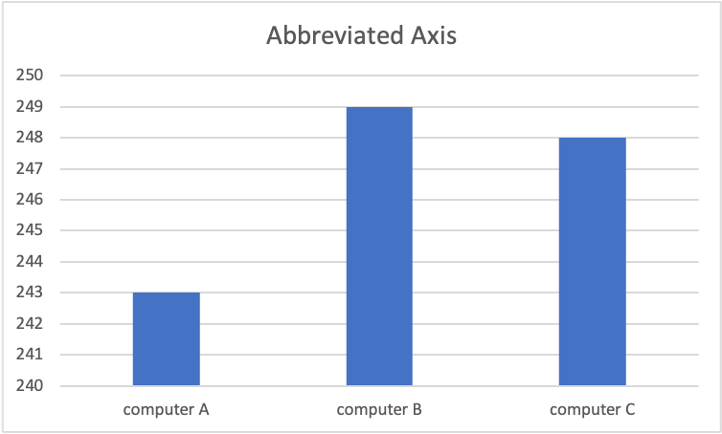
Have the scales been altered?
If you are looking at a data visualization that has an axis (or multiple axis!), examine the numerical values. Do the numerical values increase linearly? By that we mean is the distance numerically between each marking on the axis equal? If they are visually spaced equally but the numbers are not spaced equal, you are looking at a non-linear scaled axis and you should do some digging to see if that scaling was done to push you towards a certain conclusion. Purdue Pharma employed this tactic in their marketing of Oxycotin which later caught up with them criminally. The consumers of those visualizations were largely highly educated doctors who probably did okay in math — so don’t think yourself immune.
If there are two axis – do they use the same scale or are they different? This could make things seem more similar or different at first glance than they really are.
Have the axis been abbreviated?
This is not a mathematical manipulation of the scales but a visual one. It can be used to make things that are almost identical seem much more different.
If I have 3 computers and I am trying to sell you mine claiming it is faster, even though they are almost all identical, I might show you how long it takes them to add 2+2 in milliseconds, and abbreviate the axis of the visualization. Let’s say they are all within 6 milliseconds of one another, essentially identical, but I want to sell you my computer as the fastest. I can abbreviate the axis to exaggerate this tiny difference visually, and if you’re not checking closely it might work.
Does the data make sense?
Does the data make sense to compare? This is a more subjective question but it is important to always ask yourself if the data in the visualization even makes sense to compare with one another, and is it really relevant to the conclusion or decision you are trying to make. More often than you would think, some part of this doesn’t seem quite right when you start picking it apart.
Maybe something important is missing or was replaced by a value that seems similar on the surface but really isn’t the same. For example, if I am trying to show how successfully a company is, but that company is actually losing money, I might choose to visually compare that company to others by the gross revenue, instead of net profit. Revenue is typically related to profit, so people looking at my visualization may be very impressed at first glance because the revenue is very high and puts the company in the top 10% of its competitors by revenue. Many people would stop there and conclude the company is successful. But choosing to compare by revenue hides all of the internal expenses and the fact that the company is not actually profitable. For example: Tesla didn’t record its first full profitable year until 2021, but it had millions in revenue for years prior.
There is a whole world of data visualizations you can dig into further if this interests you, but these are some basic questions you can ask of any visualization as a baseline, and we hope you find them helpful!